
Logo Design | Web Design
Oak and Stone Law
Oak and Stone Law specializes in real estate and property law in Oklahoma, offering expert, client-focused solutions for disputes, foreclosure defense, and construction-related cases.
Made with High Five Media
Project Overview
For Oak and Stone Law, I developed a cohesive brand identity and website that highlight their expertise in real estate and property law. In an initial meeting, the client shared their desire for a natural feel inspired by elements of nature. Although they had long held a law degree, they were now fully dedicating themselves to their practice. Their background in construction made it essential to position them as a trusted authority in their field. The branding features a custom logo symbolizing strength and stability, while the website offers a clean, professional design with intuitive navigation. By focusing on clarity and accessibility, the project enhances Oak and Stone Law’s credibility and client engagement, providing a solid foundation for their online presence.
Challenges:
One of the main challenges was finding the right balance between tradition and modernity—creating a brand that felt both solid and established, yet fresh and approachable. The client wanted a design that reflected nature’s beauty, but without relying on the standard visuals you’d expect from a typical law firm. The logo needed to stand out while remaining timeless, and the website had to make complex legal information easy to understand, all while maintaining a professional and welcoming feel.
Deliverables:
Logo Design | Website Design
Project Team:
Lexi Dickens - Designer
Maddy Swain - Copywriter
Account Manager - Jill Richardson
The Logo
The logo design process for Oak & Stone Law began with an in-depth conversation with the founder, where I learned about his background in construction and his desire for a brand that felt grounded in nature. When asked about his ideal client, he shared that he often works with individuals who own large parcels of undeveloped land and are navigating complex litigation. This insight helped shape both the tone and symbolism of the brand.
Early design exploration focused on natural elements that could convey strength, stability, and a deep connection to the land. After reviewing a range of concepts—from minimalist icons to typographic solutions—we ultimately landed on an earthy mandala-inspired mark. The final logo combines a modern serif typeface with a detailed, nature-rooted symbol that reflects both the firm’s trustworthiness and thoughtful approach. A warm, organic color palette, drawn from natural materials and landscapes, further reinforces the brand’s approachable yet authoritative presence.

Sketches
Primary Font

Secondary Font
#0F3029
#6B786B
#C9A887
#DED6C4
#F2EDE3
Color Palette
Primary Logo
Secondary Logo

Icon

Wordmark


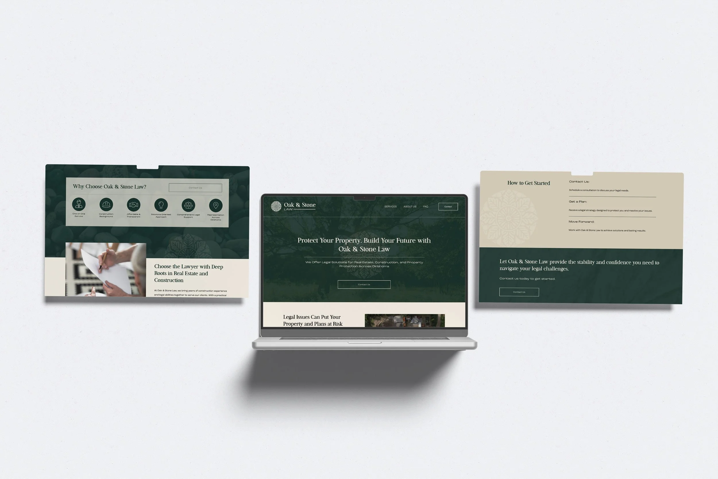
The Web Site
The Oak & Stone Law website was created to build trust and credibility through a clean, approachable design that reflects the firm’s grounded identity. I began by sketching out the site layout to establish a clear content hierarchy, then refined the structure in Figma before building the final site in Squarespace.
Based on conversations with the founder, I learned that his ideal clients are often individuals dealing with legal issues around large, undeveloped properties. With that in mind, I incorporated photography of expansive landscapes and open land throughout the site to visually connect with this audience.
Prioritizing clarity and usability, the site features dedicated service pages, a streamlined contact form, and a warm, nature-inspired aesthetic. We avoided traditional, overly formal law firm visuals in favor of earthy tones, modern typography, and subtle organic elements that convey both professionalism and approachability. The result is a polished, user-friendly website that clearly communicates Oak & Stone Law’s expertise in real estate and property law while resonating with the people they aim to serve.


